DevOps Articles
Curated articles, resources, tips and trends from the DevOps World.
Visualizing DockerCompose
6 years ago
medium.com
Summary: This is a summary of an article originally published by the source. Read the full original article here →
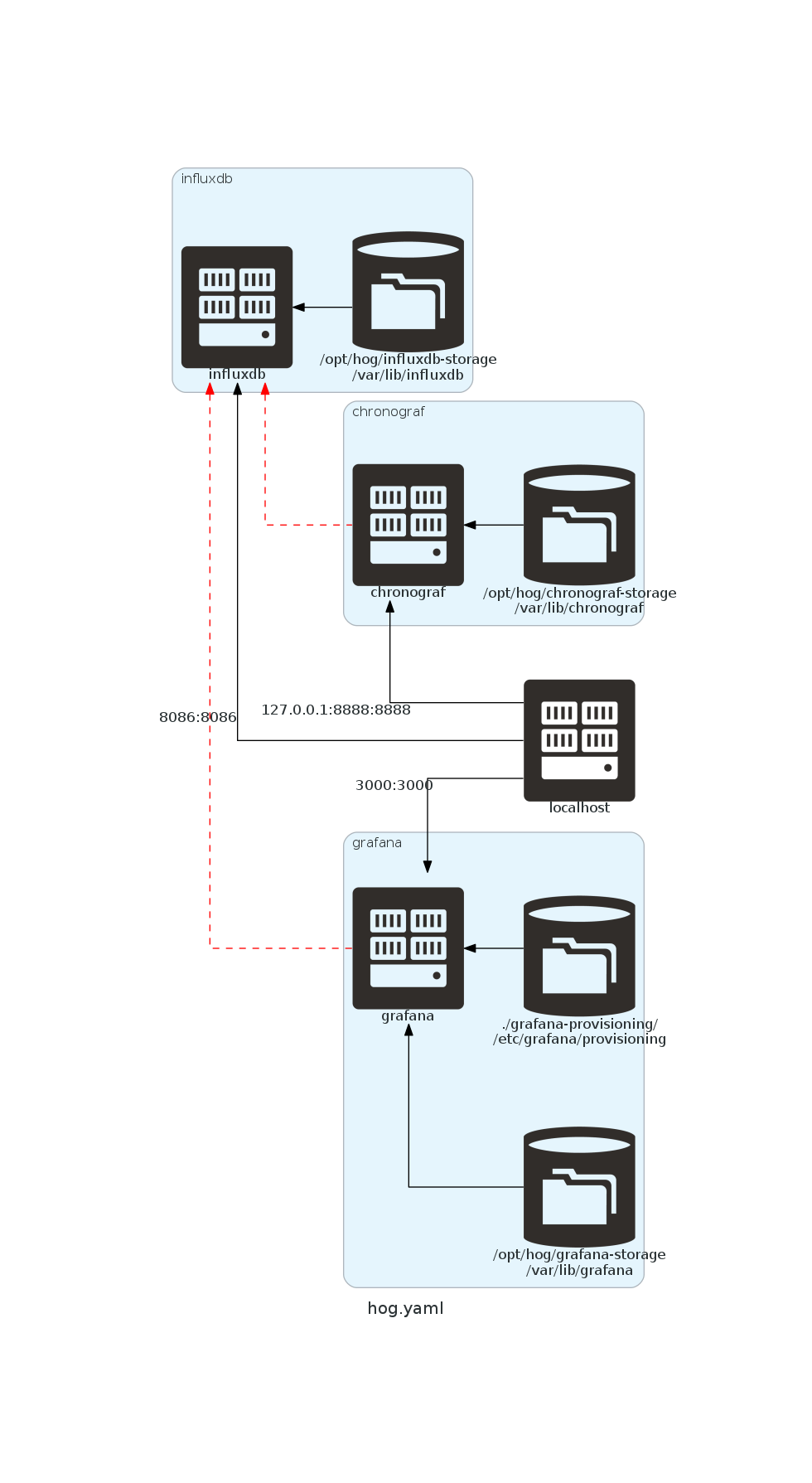
Continuing on my story line of documenting with code, I have found a neat way to visualize docker-compose files. The red dashed line indicates a dependency mapping. In this case, the grafana and chronograf services are depending on the influxdb service.


Product
Useful Links
Made with pure grit © 2026 Jetpack Labs Inc. All rights reserved. www.jetpacklabs.com